Cover Design Assignment
Research
When starting this process after reading the book to get a sense of the different stories and the feel of the book, I initially started looking at the previous covers of Just So Stories. I broke them down into different age groups to help me identify the similarities between the designs depending on the age of the audience and therefore highlighting to myself the things I should be looking out for and trying to apply to my designs.


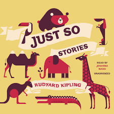


These covers in particular, shows elements of a younger audience. The animals portrayed were much more cartoon like, with childish faces, most of them showing positive emotion and with bright colours used throughout. The typography was also similar genres for younger readers, much more playful and in some case looking handwritten with is a popular theme in children’s books.
With a lot of the children’s covers, I noticed they follow simple circle patterns on the page, leading the eye towards the title or images relating to the book.
I liked the quirkier and abstract ideas much more than the cartoon animals and wanted to use some of these features in my cover, as I feel they could almost cross over to a teen age range. I then looked at versions that showed a little bit of an older range, into the teen/YA market, which is where I want to aim my cover.


These all used images from the story and of animals, but mostly the animals were much truer to life, but still maintained elements of cartoons or drawn, interpretations of animals. The animals were less likely to show positive emotions, or emotions at all and the books would focus on design choices, such as embossing or using a foil affect. With a bolder text, however it did not loose its handwritten effect most of the time in this age range. The colours used were still bright but again more representative of the true colours in nature and less colours were used, while still been eye catching.
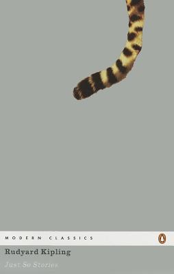
Finally, with some of the past covered, I felt they were obviously aimed at an older, adult audience. The covers were simple, less colour or a focus on just one colour. The animals, if featured, were realistic and true to life. The choices were much simpler and did not give much of the story away or appeal to a child with pictures and the idea of storytelling.


Overall my favourite covers were the ones between childhood and YA. While I love the simplicity of some of the adults designs and these are some of my favourite for books, for Just so Stories, I feel the importance needs to be the different variety of stories and different animals and therefore for me, this was better reflected in a younger style of cover.
I felt I enjoyed the way YA covers were not so childish that the stories felt like fairy tales or happy stories about animals, but I felt there needed to be more of an element of mystery about the stories and they needed to feel different, so aiming towards a more grownup market but still younger readers, verging on teenage years. I felt with all of my research this was something missing and that had not been achieved yet by and designs for the book. Just so stories is a collection of stories about various different animals, and while some stood out more than others to me, which is clearly shown with the repetition of elephants on the front of many of the covers, I wanted to make sure I was focusing on all of the animals present in the book, but while also not letting the cover give too much a way about individual stories.
When looking at similar covers in this genre but also for the children’s-YA market, there is a big increase in the popularity of nonfiction books, with lots of big, hardback books, that are beautifully designed. I really love these designs and this type of book and while, Just So Stories is a fiction book, I wanted to bring elements of this popular trend into my designs. These books still have elements of childhood involved, not all the images are true to life, everything is bright and eye-catching, it is the focus of design and making the book seem high quality and beautiful and something that needs to be owned is what I wanted to aim for. I also loved how special adding gold foil or embossing made the book feel and however often the covers were cloth-bound or matte, which really added to the high-quality feel and made the book feel more superior and stand out.


Three Initial Ideas
With all of this in mind I drew three sketches of ideas of how I could do this.
Idea 1

My first initially idea was to look at designs by Coralie Bickford-Smith and mix that with YA as well as the different Jungle Book editions I’d seen and the nonfiction designs. Be clean and bright, with gold foil, use of imagery relating to the books but only subtle, lots of intricate detail in the back. I also took inspiration from:


Idea 2

I then grew this idea as I wanted more than just a classic book feel for the book and I wanted the imagery to be more engaging and more dramatic. I focused on the idea of trees and the settings of the stories rather than each individual animal. I worked on a simple idea of a tree with lots of animal’s footprints coming to the tree to hear the stories. However, after playing with this idea I took the footprint elements and worked with this some more. I really wanted to work on a book that was using popular elements in nonfiction and use this in fiction. I also really enjoyed the below 2 covers and the idea of the path and trees. I liked the idea of leading to the stories and the element of an animal there, but the reader has to follow the path to read the stories.
Idea 3

I then came to my final idea of the trees looming in the background, but I wanted to add in the eyes of various animals peeping out from the forest. I thought this was a bit more sinister for some of the stranger stories and also made the book feel more YA. But this also, for me, added intrigue about wanting to know what was going on in the background or what was happening in the stories. I then wanted to take the handwritten style fonts of some of the classic books and the nonfiction books and add that in with gold foil elements for the title and the author on the front of the book.
Cover Development
I began by designing the title for the book, using the bright colours of the books I had taken inspiration from and also colours of the jungle and animals that, Just So Stories takes its inspiration from.
I had my InDesign cover document ready so wanted to use Photoshop to create elements that I could place and then add in words, blurbs etc to the rest of the design. I really like the handwritten element of books so decided to actually hand write the title.

I did play with various fonts, but I wanted the text to fit in with the designs and feel hand drawn. Although hand drawn, I wanted it to feel a bit more sophisticated than a childish cartoon, but maybe reflect the teen audience and how they would write and how they might interpret the book.
I wanted to indirectly add in animal references without drawing animal on the front, so I began experimenting with different animal footprints in the letters of the title, almost as if they were writing the title and telling their stories. I wanted the title to be apart of the scene in the background that I was going to develop with trees, vines, leaves etc so I started playing with this idea too. I also wanted the vines and leaves to be gold foil on the front, bits on the spine and then little flickers of them on the back cover as well. I felt this was a popular trend in lots of YA books that I had seen, in particular hardbacks, and nonfiction, so I wanted to bring all of theses themes together for my design.


Once I had a finished draft of the title, I then wanted to replicate this font on the spine to create continuity between the front and spine, so I used Photoshop to edit the letter and began placing them on the spine as well.


I experimented with different colours for the spine to match the colours of the title and used these as a base for the colours for flaps and the rest of the cover design. I was happy that the spine with in with the title design and the colours I were using were bright, but also did not use every colour like a younger child’s book might, but instead picked a theme and was used throughout. I think the spine does a good job of presenting the book from the side, still maintaining the front from the front of the book. I was unsure about the authors name on the background so worked in a yellow box around it. However this element is something I was unsure with at the time, but I do think it works with the colours and allows the name to be read clearly.


I did at one-point play around with the idea of drawing animals and filling them with gold foil words however I decided to not carry on with this idea.
It was at the point I started to worry that my work was looking too drawn, and while I wanted to create a design somewhere between YA/adult and I felt the elements of hand drawn were really popular in nonfiction, I wasn’t sure if my own drawings were professional enough and I doubted myself a lot through this process.

I then added in various eyes to get the creepier element and show the eyes of the story tellers in the trees. I found the animal eye images online, using Unsplash, a free photo website. I edited each eye and used the ones I felt were appropriate and fit in with my background design.


I also played with the idea of taking the footprints from the title and putting them in the scene to have them leading the audience into the stories.

I carried on developing my imagery and added in the title, which I felt really drew in the attention of the audience. From my initial ideas I knew I wanted elements of gold foil to be a part of the design.

I worked on the idea of using the vines and leaves in the title to be gold foil, working their way into the trees behind and also onto the spine and back cover, to carry on this theme throughout.

I experimented with various locations that the authors name could sit on the page, where it would sit without being to close to boarders and wanting to make sure it was legible. This was really tricky as making the decisions on where this would go is crucial to display the author, however I did not want to take away from the design, while also making sure the words weren’t lost on the page.

When I had created a first draft of this design, I placed it with the spine on to InDesign to get the first feel of how it would all come together.
As the front design was so detailed, I wanted to keep the back design similar but less detailed and the flaps to be just block colours, taken from the page but that wouldn’t distract from the imagery. I also needed to pick a font that worked well but wouldn’t be lost with the images or look too overwhelming.

I added a quote on the back as well as the necessary bar code, therefore not taking away from the design but allowing them to sit on the page well together and both be noticed. I thought the quote was an important one from the book but also highlighted where my design got its inspiration. I also tried to make the barcode feel part of the design, rather than just being placed on the back. I drew some vines and grass around it to try and make it feel a part of the scenery.

The flaps I kept simple design and used the front flap as the blurb for the book and the back flap to give a little background to the author and also include a picture.
Final Draft
After taking the initial first draft, I got some feedback, which I took on board, moving around the authors name and changed some of the fonts and sizes around. I am still unsure about the fonts used as it’s so difficult to pair a font with a handwritten font. However, overall, I feel I was able to create a final draft that I feel fits the brief and complies with the ideas I set out to achieve.

